2014
Kill The Hamburger Button | TechCrunch
That little three-lined button is the devil. Whether you call it a side menu, navigation drawer, or a hamburger, hiding your features off-screen behind a nondescript icon in the corner is usually a poor mobile design choice. Interaction theory, A/B tests, and the evolution of some of the top apps in the world all support the same thesis: The hamburger button is bad for engagement, and you should probably replace it with a tab bar or other navigation scheme.
Web design as troll: how The Verge Fanboys piece taunted the internet | Vox Product Blog
How do you speak to a group of extremely passionate people? What kind of design would speak to them? When Joshua Topolsky approached us about creating three different layouts in the style of three mobile UI’s we were initially torn. Something about mimicking the UI of phones didn’t feel original. But more importantly, it presented a problem of presentation. There was an inherent a UX problem to solve: do you offer presentation options or do you trick the user? We decided to troll.

Motion Ui Design Principles — Beyond Kinetic
This blog is a quick look at some simple Ui motion design principles. There isn’t too much documented about this area of mobile ui design and I thought there would be some value in expressing my views. From what is documented already I urge anyone interested in ui motion to check out Pasquale D’Silva http://psql.me/ and Johannes Tonollo’s meaningful transitions http://www.ui-transitions.com/#home.
Go Responsive with 7 Free Email Templates from Stamplia | Litmus
With nearly 50% of emails opened on mobile devices, it’s important to keep small screens in mind. We offer plenty of mobile optimization tips, inspiration and resources on the Litmus blog—and starting today, we’re also offering 7 pre-tested and bulletproof responsive templates for your next campaign.
2012
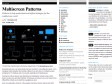
Multiscreen Patterns | precious, strategic design & visual language
(via)During the last years, our design studio has been involved in many different projects – from designing mainly websites and desktop software in our early days, to smartphone apps, prototypes for TV interfaces and more recently, applications for tablet devices.
Working for all those devices was interesting and challenging. Not just because of the diverse screen sizes and input methods, but because we learned in our user research how different the contexts are in which these gadgets are used.
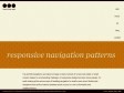
Responsive Navigation Patterns | Brad Frost Web
by 5 othersTop and left navigations are typical on large screens, but lack of screen real estate on small screens makes for an interesting challenge. As responsive design becomes more popular, it’s worth looking at the various ways of handling navigation for small screen sizes. Mobile web navigation must strike a balance between quick access to a site’s information and unobtrusiveness.
2011

Introducing the new responsive-designed BostonGlobe.com | Filament Group, Inc., Boston, MA
The Boston Globe flipped the switch today on its accessible, progressive enhancement and responsive-design based subscription news site. As front-end development leads on the project (with Ethan Marcotte at our side), we're very honored to have been involved.
2010
García Media | Homepage
print
Redesigning newspapers and magazines to engage and inform today’s hurried readers.
online
Creating user experiences that reach new media consumers more effectively.
mobile
Providing cutting-edge ideas for mobile content delivery to mobile devices.
2009
BoulevArt ¦ home ¦ your multimedia production partner
High-end web development, (Interactive) User Interface Design and Rich Internet Applications are valuable assets for your online business. Boulevart helps you create stunning websites, attractive campaigns and user friendly applications and make them easily accessible.
We offer an end-to-end range of multimedia services, complemented by partnerships with best-of-breed solution vendors and related to Cronos, a leading Belgian ICT solutions provider. Boulevart is a dynamic team of web consultants who bring complementary skills and experience to your online, narrow casting or iDTV projects.
2008
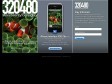
320480 ~ ThreeTwentyFourEighty
iPhone Interface psd file v1.0, most iPhone screen elements, sensible layer sets. Perfect for designing your site / app
iPhone GUI PSD
by 4 othersOver the past few months we’ve had to create a few iPhone mock ups for presentations. The problem we’ve encountered is the lack of resources to help us design something efficiently. Up until now we’ve used a nice PSD from 320480.com but we still found ourselves having to build out additional assets or heavily modifying bitmap based buttons and widgets.
2007
Mobile Web Design ~ The Series ~ Authentic Boredom
by 1 other (via)Think the mobile web finally has some legs to it? Or think it’s a folly not ready for prime time? Feel free to take sides, but don’t take issue with a topic most of us will inevitably face now or in the not-so-distant future.
2006

1
(14 marks)