2010

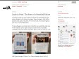
Slammer - Designer's Geometry Box
by 2 othersSlammer overlays any grid you want, anywhere you want. Typographic Grids, Golden Sections, Fibonacci series or Rule of Thirds. Slammer also has Rulers, Crosshairs, Magnifier, Measurements & Screenshots.
2009
Information Architects » Blog Archive » Links in Print: The Story of a Beautiful Failure
by 1 otherIn January 2009 we were invited to take part in a paid pitch for the print redesign for the Swiss newspaper Tages-Anzeiger. All in all five agencies took part in the pitch. We were the only UX oriented agency. The story of a beautiful failure.

2008

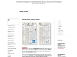
Information Architects » Blog Archive » Web Trend Map 3: Get it!
The map pins down nearly 300 of the most successful and influential websites to the greater Tokyo area train map. Different train lines correspond to different web trends such as innovation, news, social networks, and so on.
2007


Presentation Zen: What is good PowerPoint design?
by 9 othersOccasionally, I'm asked by colleagues or clients to send samples of "great slides" or "good PowerPoint." I usually hesitate to send examples of slides since my answer to the question, "what does a great PowerPoint slide look like?" is "...it depends." In a world which often thinks in terms of absolutes — "this is good, that is bad" — "it depends" is not the most popular answer.

DesignBum: Living Today's Tomorrows
Okay, my tiny parakeets, let me set this shit straight. First off, this section is crammed with tasty visual treasures that you can use in your projects, art, or whatever. It's largely the sum collective of my personal design resources not including all the cool shit I've scanned over the years (though, bandwidth providing, I'll get those up as well). There's also some experiments, half realized ideas, stickers, and wallpapers on which to feast your eyes. Additionally, some of these projects contain dingbats that I didn't create. Use these at your own risk. Almost all the dingbats I used were free where but some may not be, so exercise caution. Also, you can download all of the downloads in one file if you want. But hark, and listen to the words I now speak, for I preach a mindful vision, one pregnant with poise and intent.

Jason Santa Maria | Fighting Off Design Stagnation
I’ve only been out of school and working in the industry for a few years now, but I can already feel it. The feeling like my hands are getting tied. Like I am coming up with the same old ideas or dipping into my overused bag of tricks too often. I am left racking my brain for new directions and feeling like the design world will surely leave me behind to make way for today’s new design youth. You might laugh because it’s only been a few years, but this is where it begins.
Newsdesigner.com
a weblog about newspaper design
2006

designsoldier.ch
this web site was created in order to present the evolution of a personnal research in graphic designing as well
as its different possibilities. it presents the work of an involved graphic designer who offers fair, fresh and dynamic results. therefore designsoldier proposes a creative vision based on a permanant research and experimentation.
Edward Tufte: Books - The Visual Display of Quantitative Information
by 2 othersThe classic book on statistical graphics, charts, tables. Theory and practice in the design of data graphics, 250 illustrations of the best (and a few of the worst) statistical graphics, with detailed analysis of how to display data for precise, effective, quick analysis. Design of the high-resolution displays, small multiples. Editing and improving graphics. The data-ink ratio. Time-series, relational graphics, data maps, multivariate designs. Detection of graphical deception: design variation vs. data variation. Sources of deception. Aesthetics and data graphical displays.

Reflections are the new drop shadows
by 1 other, 4 commentsJason Fried's reflexion about reflections

Halfway to Paradize - Magazine
Juan / Art Director / Paris

graphpaper.com - Microsoft Word’s Useless Buttons
It’s not bragging (in fact, it’s probably a little embarassing) for me to say that I am an expert user of Microsoft Word. I can do just about anything I want with it, and I understand most of Word’s idiosyncracies and tricks. Still, the UI has always seemed to get in my way. For example, there are a ton of buttons I never use — so for kicks I decided to see just how many.

Subtraction: Mirror, Mirror
(via)The lesson that I’ll take away from all of this is: avoid using reflections, unless it’s the year 2016 and you’re going for an unmistakably retro and kitschy 2006 look.
etapes.com
by 10 othersPlus qu’un passage vers ses pages intérieures, la home d’étapes.com se propose d’être une place d’échange de curiosités, un point de départ vers d’autres lieux dans le monde et sur Internet. Aller se ressourcer pour revenir partager une impression ou étancher une envie d’images.
2005

KEEPSMESANE
by 5 othersKeepsmesane™ is the portfolio of Darren Firth, showcasing a variety of Personal and Commercial projects between 2002/2005. All Commercial work was carried out at Un.titled.


Microsoft Expression
Microsoft Expression™ takes the many sides of your creative personality to all new levels. Professional design tools give you greater flexibility to create sophisticated applications and content. Innovative technologies enable faster and richer interface development for Windows applications or the Web. Compatibility between products increases all levels of your personal productivity


Art. Lebedev Studio
by 6 othersArt. Lebedev Studio was founded in 1995. At present, it is the largest design company in Russia. We do industrial design, graphic design, web design and interface engineering. We have our own training center, a publishing house, a media department, and three software teams.