2016

2014

Heartbleed, The First Security Bug With A Cool Logo | TechCrunch
It’s been fascinating to watch news of heartbleed, the massive OpenSSL exploit, spread on the web. After years of quietly putting us at risk, the general web user became aware of the exploit only a few days ago, and probably via heartbleed.com.
Logos in Lego Town
I love the list of 'fictional universes' on Wikipedia. It contains everything from The Simpsons to Star Trek to The Wizarding World of Harry Potter. The Fictional Universes database on Freebase is even better, as it contains thousands of details about the universes, such as species, objects, and even ethnicities.
2013

Brandseen - Logo Coloring Game
How well do you know some of the most popular brands on earth? Find out by selecting the color you associate with each logo - you'll be scored based on how close your response matches the original brand. See how well your score compares with others! Enjoy.
2012

50 Japanese town logos with kanji ~ Pink Tentacle
Here is a collection of 50 Japanese town logos that incorporate stylized kanji characters into the design.
2010

Logo Process – Keyboard Kahuna Identity Development
Often hard to imagine so such much work going into a logo design project, more so when the final logo design is so clean and ’simple’. This is often the way, a logo design process post helps put the whole project into context, to see the amount of work required behind the scenes.
2009


2008
JAY-O.COM | Jan Olof Nygren
THIS SITE CONTAINS SAMPLES OF THE WORK OF THE FABULOUS MR. JAN OLOF NYGREN.
IT IS A MIX OF SELF INITIATED PROJECTS DONE AT CRANBROOK AND CLIENT WORK.
Vintage Logos : un album photos sur Flickr
Collection of vintage logos from a mid-70's edition of the book World of Logotypes.
NOTE: I did not create any of this work! This book is out of print but can probably be found with some scouring.
Logos Google
Nous possédons un vaste éventail de logos qui représentent les fêtes et les événements marquants de l'année. Vous pouvez les découvrir dans notre musée en ligne, mais vous ne pouvez pas les utiliser. Pour inclure un lien vers Google sur votre site, utilisez l'un des logos officiels.

Ironic Sans: You got your picture in my logo
I’ve been noticing logos lately that have replaced letters with pictures. I think it’s fascinating how the brain just fills in the blanks, whether or not the pictures actually resemble the letters they replace. Various studies have shown that we don’t look at the letters which make up words as much as we look at the shapes of the words as a whole. In fact, it deosn’t mttaer in waht oredr the ltteers in a wrod are, the olny iprmoetnt tihng is taht frist and lsat ltteer is at the rghit pclae. The brain just takes care of the rest.
2007
Au Blason des Armoiries : Héraldique, art et science du blason
L’héraldique, ou science des armoiries, étudie les symboles peints, gravés ou dessinés, propres à chaque famille en possédant. Ces symboles ont pour support un écu formant un blason, qui peut être surmonté d’un cimier et, éventuellement d’une couronne, supporté par des animaux allégoriques (supports) ou des personnages (tenants), et illustré d’un listel où figure une devise. Cet ensemble constitue l’armoirie.
Hubert Lamant-Duhart, Armorial du Pays-Basque

GASO - la banque du blason
C'est le support de votre blason. Il peut avoir plusieurs formes : la plus classique, qui découle de la forme du bouclier, est l'écu "ancien" en forme d'ogive renversée. On adoptera au XVIIe siècle l'écu dit "moderne" à base en forme d'accolade, plus facile à utiliser pour des compositions complexes. Un écu aux proportions harmonieuses doit avoir une hauteur équivalant à peu près aux 7/6 ou 8/7 de sa largeur.
Il est très facile de construire un écu ancien avec seulement une règle graduée et un compas. Il suffit de partir de la largeur de l'écu et de suivre les indications.
Héraldique Logotype | Art du blason et identité graphique
Construction et explications autour du blason
Hausschrift-Liste Unternehmen-zu-Schrift - Typografie.info TypoWiki
Companies typefaces
shillPages - Movie Title Screens Page
What good is it? Whatever use you put it to. Browse and admire title and logo designs, check out movies that have completely different titles in different release prints (see Battle of Britain or The Premature Burial for good examples), check out the differences in multiple releases of the same title (see Aliens or Invasion of the Body Snatchers for a good example), check to see just how "wide" is the widescreen (width/height=aspect ratio... and does it match the sleeve description?)... use the logo when designing a web page for your favourite movie...include the title screens in your video database... the possibilities are... well, not endless, but many! Please note that the aspect ratio shown is merely calculated from the image size and, although very close to the actual ratio, may not be 100% accurate.

LogoPond - Identity Inspiration
Gallery of thousands of brand new unused logos
The Serif - Your daily dose of design inspiration - The Serif
Peter Saville said “I find it a bit cheesy. Those rings don’t sit happily within that angular form and the typographic expression of London is a little insecure and apologetic. On the other hand, it’s incredibly noticable, brave and confrontational. Designs which are effective are abrasive on our sensibilities initially, that is how they work. It doesn’t have to be nice because they are familiar, while a great design forges a new aesthetic. It’s real job is to be a catalyst for awareness of the Olympics and it’s doing that already”.
Rita Clifton of Interbrand said the logo would not be to everyone’s taste but would engage its target audience of young people successfully. “It’s got that Marmite factor
BBC NEWS | Epilepsy fears over 2012 footage
A segment of animated footage promoting the 2012 Olympic Games has been removed from the organisers' website after fears it could trigger epileptic fits.
Prof Graham Harding, who developed the test used to measure photo-sensitivity levels in TV material, said it should not be broadcast again.
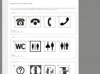
Comparative Test of Public Symbols - The Form Assembly
This is an online survey to research the existing public symbols and pictogram standards. In the list each topic or theme has four visual answers, please choose the most easily identifiable sign from the rows. Thanks for your patience!
design et typo » Blog Archive » L’image de marque des Partis Politiques Français
Si l’on examine l’ensemble de ces marques on constate globalement une mise en perspective des projets ou du moins des positionnements politiques de chacun des partis représentés. Mais dire que ces marques sont vraiment porteurs des valeurs contemporaines des préoccupations des électeurs, il y a un pas.
