2018
JAVASCRIPT / CSS - DEMO - Scrolling Letters Animation | Codrops
A switching title effect where a fixed text element changes with an animation depending on the scroll position.The animations are powered by anime anime.js. We also use imagesLoaded for preloading the images and Charming.js for the handling the letter structure of the titles.
DEV - TUTO - the new code – Web Developer Reading List: CSS Typography
A well-known dictum states that web design is 95% typography. Despite the prevalence of rich media, videos and games, people come to the web primarily to read. Making that reading experience comfortable, interesting and enjoyable is a major factor in keeping people on web sites longer and enhances their ability to retain and remember information.
Goals: Control the display of web page text to enhance communication.
Prerequisite: Color
Total time: 8 hours
2017
CSS - DESIG ONLINE TOOL - Responsive web design tool, CMS, and hosting platform | Webflow
(via)Webflow gives designers and developers the power to design, build, and launch responsive websites visually, while writing clean, semantic code for you.
SVG - ONLINE TOOL - 20 Useful SVG Tools for Better Graphics - Hongkiat
(via)SVG is gaining popularity in web design these days and you can use tools like Illustrator or Inkscape to create SVG graphics. But when it comes to web design, we should always optimize for lighter results.
Here the 20 tools that you can use to work with SVG quickly and efficiently. We have mostly online tools, that can help in optimization, conversion, making patterns, and more.
SVG - ONLINE TOOL - Draw SVG
You can perform a wide variety of designs, art as the icon of DRAW-SVG, mapping, technical, presentation slides, etc. ..
CSS - How to Resize Background Images with CSS3 — SitePoint
(via)Fortunately, CSS3 introduces the background-size property which allows backgrounds to be stretched or squashed. It’s ideal if you’re creating a template using Responsive Web Design techniques.
There are several ways to define sizing dimensions — view the CSS3 background-size demonstration page.
CSS - Using DevTools to Tweak Designs in the Browser | CSS-Tricks - 2017
Let's look at some ways we can use the browsers DevTools to do design work. There are a few somewhat hidden tricks you mind find handy!
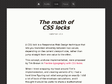
CSS - RESPONSIVE - MEDIA QUERIES - The math of CSS locks
A CSS lock is a Responsive Web Design technique that lets you transition smoothly between two values, depending on the current viewport size, rather than jump straight from one value to the other.

JQUERY / CSS - EQCSS • Element Query CSS | Scoped CSS, Meta-Selectors, Element Queries
by 1 otherWhat are Element Queries?
Element queries are a new way of thinking about responsive web design where the responsive conditions apply to elements on the page instead of the width or height of the browser.
Unlike CSS @media queries, @element Queries are aware of more than just the width and height of the browser, you can write responsive conditions for a number of different situations like how many characters of text or child elements an element contains.
Another concept that element queries brings to CSS is the idea of ‘scoping’ your styles to one element in the same way that JavaScript functions define a new scope for the variables they contain.
2014
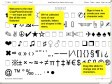
CSS ICON - ✿ Our favorite set — CopyPasteCharacter.com
by 12 othersWhat is CopyPasteCharacter.com?
A web and iPhone application for copying the ‘hidden’ characters that comes with the computer’s typefaces, to be pasted into emails, tweets, text documents, forums and whatever else you might need to spice up with an extra ♔, ฿ or, ❒.

CSS ICON - One div - Icons in pure css - The single element HTML/CSS icon database
by 1 otherAll icons displayed on the website are realised in pure css with only one html div. The challenge is also to provide an alternative to SVG. Indeed icons allow precise borders preserved even resized (As vector format). Then we can see a clear interest in responsive design.
CSS - EDITOR - plugin - With Emmet Turbo-Charge Your CSS - Tuts+ Web Design Article
Emmet is a collection of abbreviations that expand into html/xml/css, taking the idea of text snippets further. Visit the download page and install Emmet for your editor of choice.
When working with Emmet, type in the appropriate abbreviation and hit the action key. In Sublime Text this is the TAB key. The syntax of the file you are working on will determine which abbreviations to use
CSS - Responsive Design - Break-points come from content
To me, it seems more realistic to check our layouts through viewports of arbitrary dimensions and shapes. We don't need anything fancy, we can simply drag the bottom right corner of our favorite desktop browser to enter... "Device Agnostic Mode".
CSS - VIEWPORT BOOKMARKLET : Viewport resizer
by 3 othersResponsive design bookmarklet :
Viewport resizer is a browser-based tool to test any website’s responsiveness.
2013
CSS - FONT - ONLINE TOOL - FontDropper 1000 - Play with Web Fonts
Play with Web Fonts: This is the easiest way to test or design with web fonts from WebINK. Just open FontDropper 1000 on any web page and start dropping fonts. See your changes instantly. Adjust font size, color, spacing and more
2009
Pompage.net
by 38 othersLe Webdesign puisé à la source : de nombreux articles de référence traduit en français.
Delicious.com - Tags on left, meta on right | userstyles.org
Move the tag chain to the left and left-align it, and move all the various things that end up in the "meta" div to the right. What the meta div holds depends on the page you're viewing. When viewing your own bookmarks, the meta div contains the group of action links (share/edit//delete). On the Network view and when browsing the site by tag, it holds the account name of the person who contributed the link. On the search results page and when browsing Popular bookmarks, it has the "First saved by" information.
2008
Stylish ___Firefox, Thunderbird, Flock, SeaMonkey, Mozilla Suite, and Songbird Extension__Allows easy management of user styles. userstyles.org
by 1 otherLetting you fix ugly sites, customize the look of your browser or mail client. Stylish is to CSS what Greasemonkey is to JavaScript, and unlike other methods of using user styles, most styles take effect immediately.
Smashing Coding est un blog collaboratif rédigé par des web-développeurs
by 5 othersle plein d'infos
2007
Stylish___le relookage complet des pages web
by 1 otherEn leur appliquant des styles CSS de votre cru. Milliers de styles à choisir, pour gros sites ou pour tous. Etonnant !

web developers extension__________addons.mozilla.
by 2 othersif you get the excellent "web developers extension" addons.mozilla.org/extensions/moreinfo.php?id=60 for firefox, it has a tool that lets you edit the style of a page on the fly. it also then lets you save it and apply that style sheet to the whole site.
2006

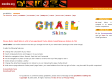
mozdev.org - gmailskins: index (-) extention
by 5 othersWhat it is Gmail Skins is a Firefox extension that tries to make your Gmail experiance a little better. What it does Click an item for a screenshot. * Change the colour of your inbox - Choose colours from green to dark green! * View weather, google calend
