July 2006

Flickr: The Web 2.Oh No! Pool
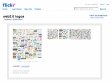
by 2 othersThe original intention of this little collaboration was to make a mockery of the current web 2.0 design style. It poked fun at major companies foolishly branding and rebranding without considering the effects of a trend. Most of the designers who participated understand the humor behind the initial idea and intentionally made poor, obvious logo mashups.
June 2006
web2.0 logos - a photoset on Flickr
by 1 otherLudwig Gatzke’s compilation of nearly 400 Web 2.0 logos
March 2006
The Logos of Web 2.0 | The FontShop FontFeed | Font blog, typography tips, and design news.
by 45 othersBut even more characteristic among these brands is their appearance. Web 2.0 sites nearly always feel open and friendly and often use small chunks of large type. The colors are bright and cheery — lots of blue, orange, and what we jokingly call the official color of Web 2.0: lime green.
1
(3 marks)