2009

About - cufon - GitHub
Cufón aims to become a worthy alternative to sIFR, which despite its merits still remains painfully tricky to set up and use. To achieve this ambitious goal the following requirements were set:
1. No plug-ins required – it can only use features natively supported by the client
2. Compatibility – it has to work on every major browser on the market
3. Ease of use – no or near-zero configuration needed for standard use cases
4. Speed – it has to be fast, even for sufficiently large amounts of text
And now, after nearly a year of planning and research we believe that these requirements have been met.

Facing up to Fonts | Slides and notes
Led by Richard Rutter
Browser support for the typographical aspects of CSS is gradually increasing. Things are on the up.
Richard will be trouncing the myth of web-safe fonts, demonstrating how to go beyond bold, detailing the technicalities of font embedding and exploring the commercial and ethical minefield therein.
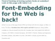
The introduction of font embedding in particular is a long-awaited step in the right direction. However it brings with it a host of complications; technical, ethical and aesthetic.
This session will explain all.
2008
FDI fonts.info – font-face embedding demo
Safari 3.1 for Windows and Mac supports the embedding of “sfnt fonts” (TrueType, OpenType PS, OpenType TT) using the font-face declaration. Technically the fonts are not embedded in the website, but they are simply linked like an image file. Thus the fonts need to be stored on a public server. Since you cannot upload commercial fonts to a public webserver, you are limited to freeware fonts. FDI fonts.info believes in the future of web fonts, so we decided to provide webdesigners with a set of high-quality web fonts supporting a wide range of character encodings. Graublau Sans Web regular and bold can be downloaded for free from fonts.info and you may embed them in any website you like. If you do, please put a link to fonts.info on your site and mind the End User License Agreement.
2007
Les fontes iphone
L’iPhone Apple est sorti le 29 novembre 2007 en France. Les allumés des caractères n’auront pas raté la comparaison des fontes (merci Daring Fireball) présentes sur iPhone, notamment sur le navigateur Safari iPhone, versus Safari MacOsX. Une autre liste de caractères est disponible ici.
L’interface en Helvetica, c’est pas si gênant, même pour les plus anti-caractère par défaut. Même si John D Berry pense le contraire. Le plus étonnant c’est de découvrir que le Lucida Grande n’est pas présent, comme sur MacOs X. De nombreux sites web avaient pris l’habitude de spécifier le Lucida Grande comme fonte par défaut dans leurs CSS, comme le typographe.com, plus sympa que les éternels Verdana-Trebuchet-Arial. Enfin, ces fontes semblent être au format .ttf et pas .dfont, comme sur MacOs X.
2006
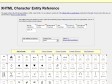
XHTML Character Entity Reference
This page contains the 252 allowed entities in HTML 4 and XHTML 1.0, as outlined in section 24 of the official HTML 4 specifications, published by the W3C. If you're new to this site, you can find help on how to use this reference.
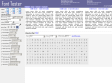
Font Tester - Online Font Comparison Tool - Preview Fonts - Compare Screen Type
Font Tester is a free online font comparison tool. It allows you to easily preview and compare different fonts side by side with various CSS font styles applied to them. It is very useful for web developers who are looking for just the right font/style/color to use in their pages. To use it all you have to do is simply enter the text you would like to preview, modify the various CSS properties until you find a style you like, and then click on the Get CSS Code button to generate all the necassary CSS code to reproduce those styles in your webpage.

Quirky serifs aside, Georgia fonts win on Web - Style - International Herald Tribune
The IHT on a resurgence in popularity of the Georgia typeface online - "That is why we felt ready to forsake Verdana's clarity for Georgia's quirky serifs - at least until the next newly fashionable typeface comes along.'
dotWiki > Articles > TheWindowsVistaFonts
# Cambria is a smaller, more readable version of Georgia. Then again, all serif fonts look alike to me.
# Calibri is like a slightly condensed version of Corbel and Candara.
# Calibri, Candara, and Corbel are all too small compared to the current set of de facto Windows fonts (such as Georgia at 12pt compared with Calibri at 12pt) to make them impossible to use along with a current Windows font in a browser. For example, using Georgia and Calibri in your browser produces readable serif text but small, unreadable sans-serif text since both fonts must use the same font size.

Jensen Harris: An Office User Interface Blog : Fonts
Last month, I introduced Segoe UI, the new user interface font for Office 12 and Windows Vista.
Of course, you spend most of your time in Office not looking at the user interface, but working with documents. Times New Roman has been Word's default font since Word 6.0 introduced support for TrueType fonts. Although there are numerous other options available, most documents today are produced in Times New Roman, Arial, or more recently the Web-friendly choice Verdana.

Scobleizer - Microsoft Geek Blogger » Cleartype improves reading comprehension, study says
Microsoft ClearType is an unprecedented innovation in font display technology that dramatically improves font display resolution and marks a genuine breakthrough in screen readability.
Coding Horror: Consolas and ClearType
However, I prefer not to use font smoothing on my programming fonts. And Consolas looks like crap without ClearType! Consolas appears to lack any kind of hinting for reasonable display at small point sizes. Consolas isn't just optimized for ClearType, it can barely be used without it.
Microsoft Typography - Features of TrueType and OpenType
Microsoft ClearType is an unprecedented innovation in font display technology that dramatically improves font display resolution and marks a genuine breakthrough in screen readability.
2004
Code Style: Windows font survey results
Windows font survey results
How sure can you be that the font you specify will be present on the end user's machine? The results below are the latest periodic snapshot of the Code Style Windows font survey and should give you greater confidence in selecting a font. Use the article feedback form below if you want to be alerted to future updates.
Typefaces for the screen
Georgia & Verdana
Typefaces designed for the screen (finally) + Real fonts on the web? Read the very latest, Includes links for downloading free fonts designed to make web-reading easier.