2010

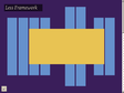
The 1140px CSS Grid System/Framework · Fluid down to mobile
 by gregg & 5 others
The 1140 grid fits perfectly into a 1280 monitor. On smaller monitors it becomes fluid and adapts to the width of the browser.
Beyond a certain point it uses media queries to serve up a mobile version, which essentially stacks all the columns on top of each other so the flow of information still makes sense.
Scrap 1024! Design once at 1140 for 1280, and with very little extra work, it will adapt itself to work on just about any monitor, even mobile.

Opera's Developer Relations Team - There's more to mobile than media queries
 by nhoizey
Designing for low spec, slow connection speed devices and then progressively enhancing, although not a silver bullet, seems to be the best foundation for a maintainable, accessible and future-proof site.

2009

Return of the Mobile Style Sheet | alistapart.com
 by simon_bricolo
Conseils sur l'utilisation de feuille de style pour les mobiles
2007

2006


7 steps to better handheld browsing
 by sunny & 2 others
Étapes pour améliorer ses sites pour les petits appareils.

