April 2012

March 2012
November 2011
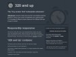
320 and up
 by Spone & 1 other
‘320 and Up’ prevents mobile devices from downloading desktop assets by using a tiny screen’s stylesheet as its starting point. Try this page at different window sizes and on different devices to see it in action.
July 2011
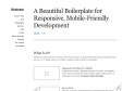
Skeleton: Beautiful Boilerplate for Responsive, Mobile-Friendly Development
by Spone
Skeleton is a small collection of CSS & JS files that can help you rapidly develop sites that look beautiful at any size, be it a 17" laptop screen or an iPhone.
1
(4 marks)