November 2006
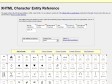
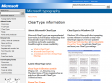
XHTML Character Entity Reference
by 53 others (via)This page contains the 252 allowed entities in HTML 4 and XHTML 1.0, as outlined in section 24 of the official HTML 4 specifications, published by the W3C. If you're new to this site, you can find help on how to use this reference.
July 2006

Quirky serifs aside, Georgia fonts win on Web - Style - International Herald Tribune
(via)The IHT on a resurgence in popularity of the Georgia typeface online - "That is why we felt ready to forsake Verdana's clarity for Georgia's quirky serifs - at least until the next newly fashionable typeface comes along.'
January 2006
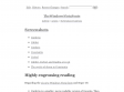
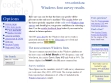
dotWiki > Articles > TheWindowsVistaFonts
# Cambria is a smaller, more readable version of Georgia. Then again, all serif fonts look alike to me.
# Calibri is like a slightly condensed version of Corbel and Candara.
# Calibri, Candara, and Corbel are all too small compared to the current set of de facto Windows fonts (such as Georgia at 12pt compared with Calibri at 12pt) to make them impossible to use along with a current Windows font in a browser. For example, using Georgia and Calibri in your browser produces readable serif text but small, unreadable sans-serif text since both fonts must use the same font size.
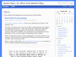
Jensen Harris: An Office User Interface Blog : Fonts
Last month, I introduced Segoe UI, the new user interface font for Office 12 and Windows Vista.
Of course, you spend most of your time in Office not looking at the user interface, but working with documents. Times New Roman has been Word's default font since Word 6.0 introduced support for TrueType fonts. Although there are numerous other options available, most documents today are produced in Times New Roman, Arial, or more recently the Web-friendly choice Verdana.

Scobleizer - Microsoft Geek Blogger » Cleartype improves reading comprehension, study says
Microsoft ClearType is an unprecedented innovation in font display technology that dramatically improves font display resolution and marks a genuine breakthrough in screen readability.
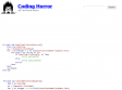
Coding Horror: Consolas and ClearType
However, I prefer not to use font smoothing on my programming fonts. And Consolas looks like crap without ClearType! Consolas appears to lack any kind of hinting for reasonable display at small point sizes. Consolas isn't just optimized for ClearType, it can barely be used without it.
Microsoft Typography - Features of TrueType and OpenType
Microsoft ClearType is an unprecedented innovation in font display technology that dramatically improves font display resolution and marks a genuine breakthrough in screen readability.
November 2004
Code Style: Windows font survey results
by 3 othersWindows font survey results
How sure can you be that the font you specify will be present on the end user's machine? The results below are the latest periodic snapshot of the Code Style Windows font survey and should give you greater confidence in selecting a font. Use the article feedback form below if you want to be alerted to future updates.
Typefaces for the screen
Georgia & Verdana
Typefaces designed for the screen (finally) + Real fonts on the web? Read the very latest, Includes links for downloading free fonts designed to make web-reading easier.