22 July 2010
Better Reading on the iPad: iBooks 1.1, VQR, & PDF | The FontFeed
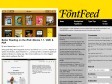
Some good things have happened since my post full of iPad grumbles. Time for an update. On Monday, Apple released iOS 4, and along with it a small but significant update to iBooks, its e-reader app. This revision addresses two of my biggest gripes about reading on the iPad.
21 July 2010

20 July 2010

FontFonter
Web FontFonts are high quality, screen-optimized fonts designed specifically for web use. Learn more »
FontFonter uses custom CSS and other techniques to temporarily replace a site’s font styles with Web FontFonts.
19 July 2010

cityfont.com — voice of a city.
The project "cityfont.com" is lead by Type Project Japan Inc. We're now making activity to realize the CITY FONT in Japan refering to the precedent project of the city font all over the world. We aim to raise the worth of the city with typeface and explore the potential of typeface.
16 July 2010

Fighting the @font-face FOUT « Paul Irish
I really don't like the text upgrade FOUT, so I personally prefer webkit's technique. But either way, we want the font loaded ASAP, so let's speed it up!

Introducing Loremify / Tobias Bjerrome Ahlin
Loremify is a one-click tool to copy Lorem Ipsum. It lets you wrap in html, specify the amount of text, and copy it to your clipboard—all in one click. It runs as a Dashboard Widget in Mac OS X, and is a mere 270kb download.
12 July 2010
09 July 2010
07 July 2010

04 July 2010
30 June 2010

Fred Eerdekens
Entering the artistic space of Fred Eerdekens places the spectator in a semantic landscape in which what one had thought of as stable meanings are continually twisted and turned. What better way to figurize this than by letting the spectators themselves ‘twist and turn’ in trying to make sense of the objects. In spiralling around the objects, they in fact become direct figures of the play of logic that rules the objects. After the linguistic turn, and in the wake of post-structuralist thought, the topography of our mental landscapes has become increasingly intricate. The work of Fred Eerdekens attests to this fact and it provides a conceptual map of this, in many places still unknown territory.
29 June 2010
Linotype.com /// Corporate Fonts
Linotype vous offre la possibilité de télécharger des caractères dans le cadre d’une zone d’achats protégée par un mot de passe. Cela permet à toute agence ou prestataire de service d’obtenir un accès rapide et pratique aux fontes CorporateType de leurs clients.
28 June 2010

24 June 2010

23 June 2010

21 June 2010
18 June 2010
17 June 2010


Timothy McSweeney's Internet Tendency: I'm Comic Sans, Asshole.
Listen up. I know the shit you've been saying behind my back. You think I'm stupid. You think I'm immature. You think I'm a malformed, pathetic excuse for a font. Well think again, nerdhole, because I'm Comic Sans, and I'm the best thing to happen to typography since Johannes fucking Gutenberg.

eye | feature : Fashion’s obsessions are mirrored in its typography, From Vogue’s femme serifs to butch Chanel and the hybrid YSL logo
As late as 1955, Vogue covers vacillated between serif and sans serif typefaces, as well as script faces and illustrative, photographic letters. It was after 1955 that the magazine appears to have legislated a consistent use of the all-capitals banner headline set in Didone lettering. Apart from minor details, it has remained absolutely fixed since then, the trade-dress of a powerful international franchise.

Frieze Magazine | Archive | New Faces
It only takes a glance at the cover of any recent Paris Vogue to see that something odd is afoot. There’s the hair for a start. Veering between the lank and the bushy, it never quite achieves the luxuriant waves that are the norm. All around are quirky touches: idiosyncratic typefaces, hand-drawn motifs and even collage. This may not sound like much, but in the context of fashion magazines Paris Vogue is doing more than bucking a trend; it is attempting to shrug off a genre.