2011
See It, Read It, Eat It
Japanese graphic designer Masaaki Hiromura has made pictograms an integral part of the kanji characters he created for Tokyo’s Kitasenjyu Marui department store to come up with food words that can be understood in any language. The silhouette of the food appropriately replaces a stroke in the word so it can be read as text. Although Hiromura was probably focused on devising a witty and graphically interesting way to communicate to multinational customers who frequent the store, this display seems like the reverse of how written languages began in many ancient cultures. Japanese and Chinese characters started as pictographs, ideographic symbols describing objects and actions. Over time, these characters became less pictographic and ideographic and more visually abstract. What’s amusing about these pictogram characters is that we’ve come full circle.
2010
PingMag - The Tokyo-based magazine about “Design and Making Things” » Archive » The Bunshi School of Edomoji
What vigorous brush strokes! These friendly looking Edomoji, or “Edo characters,” are traditional Japanese fonts that were developed in the Edo Period (1603 to 1868). Today, they haven’t lost their attraction! Now, PingMag talks to self-taught calligrapher Bunshi Tachikawa who got so much into Edomoji that he threw his experience as graphic designer over board and created a brand new style himself – now known as the Bunshi School of Edomoji. A brand new school!

Font | MORISAWA
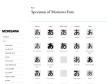
Without difficulty, Japanese people use a combination of four different types of character systems: kanji,hiragana, katakana, and the English alphabet. This is a very unusual system not seen in any other country in the world. Each of the kanji characters, forming the core of the Japanese writing system, usually serves also as a word. Elements of Japanese culture have been embedded in these kanji characters through their forms and images. In addition,most kanji characters have two or more pronunciations and a variety of meanings.
2004
ZETUEI FONTS
Japanese fonts , kana, katakana and others
ZETUEI is the meaning of the quickness that a shadow is not left.
Have your character, Have your Handwritting, Have your fonts
1
(6 marks)