2014

Discover what would happen if fonts had children - Digital Arts
New sketches from Mr Cromso imagine the offspring of five pairs of familiar typefaces.
2013

‘Kama Sutra’ Typography Is Sexy From A to Z - DesignTAXI.com
After giving Penguin’s classic ‘Kama Sutra’ book cover a makeover, London-based French designer Malika Favre decided to create a raunchy illustrated typographic series.
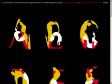
The Kama Sutra Project — A-Z
The Kama Sutra Alphabet is a personal project from French born and London based illustrator Malika Favre.
2009
Wallpaper* Magazine | Sex Issue: Type Tart Cards |
Tart cards are the means by which many London prostitutes advertise their services. Step into almost any central London phone box and you can contemplate up to 80 cards inviting you to be tied, teased, spanked or massaged.
Even if a police crackdown, the internet and the increasing use of mobile phones suggest their days are numbered, tart cards are still so pervasive they are now regarded as items of accidental art and have something of a cult following. Once on the periphery of design, tart cards have influenced the work of many mainstream artists such as Royal Academician Tom Phillips and Sex Pistols designer Ray and Nils Stevenson.
2007
Gold Epica Awards - Taylor Lane, "Studio Pin-Ups"
How do you reach lots of agency creatives when you've got a tiny budget? Put your message on something they stare at all day long: the wall. This makeover of the traditional 'studio pin-up' calendar not only demonstrated Taylor Lane's expertise in typography, it also acted as a perpetual reminder of them throughout 2005 while refreshing itself every month. It was controversial; it provoked comment and created a 25% increase in turnover from existing and new clients.
Creative Director(s): David Harris
Copywriter(s): Peter West
Art Director(s): David Harris
Photographer(s): N/A
Illustrator(s): N/A
Other(s): Typographers: David Harris; Justin Shill; Stuart Addy; Jan Hansen


2005

The erotics of type
From the simple figure 69, to elaborate tongue-in-cheek exercises like Michael Worthington's 'Dominatrix' typeface, typographers and type designers as well as readers (and censors) have used letters and ciphers to suggest 'prurient' content. (!)
1
(8 marks)