December 2006

Free Font Manifesto
A small but growing number of designers and institutions are creating typefaces for the public domain. These designers are participating in the broader open source and copyleft movements, which seek to stimulate worldwide creativity via a collective information commons.
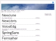

What are the most popular typefaces on the front pages of our daily newspapers?
What are the most popular typefaces on the front pages of our daily newspapers? A recent survey of 100 papers reveals much about the type business today.

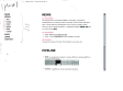
The 10 most popular newspaper typefaces - (37signals)
The 10 most popular typeface families in American newspapers according to a study by Ascender Corporation
November 2006


Typographica. A Journal of Typography.
Typographica is a journal of typography featuring news, observations, and open commentary on fonts and typographic design.

JustFontIt site
This is the site for the JustFontIt project, a new utility for font professionals. In addition to GUI font editors, JustFontIt provides a wide range of features, required to quickly bring the fonts to a sellable state. This includes through font testing against effective criteria what allows to pinpoint typical font bugs, ability to make safe patches in Type1 fonts, generating clean font metrics, conversion between Type1 Binary and Type1 ASCII formats, generation of customizable lists of font properties and more.

spiekerblog | scroll down all the way!
Erik Spiekermann is information architect, type designer (ff Meta, itc Officina, ff Info, ff Unit, LoType, Berliner Grotesk et al) and author. He was founder (1979) of MetaDesign, Germany’s largest design firm with offices in Berlin, London and San Francisco. In 1988 he started FontShop. He holds an honorary professorship at the Academy of Arts in Bremen, is board member of ATypI and the German Design Council, and president of the istd International Society of Typographic Designers. In July 2000, Erik left MetaDesign Berlin. He now lives and works in Berlin, London and San Francisco, designing publications, complex design systems and more typefaces.

Typograf - font management for OpenType,TrueType and Type 1 print-preview-load
The Typograf top class font manager
* previews all OpenType, TrueType, PostScript Type 1 and printer fonts,
* displays all font properties (typeface classification, kerning pairs, file data, copyright...),
* views character set, keyboard layout, zoom view,
* finds similar fonts and compares several fonts,
* prints fonts in many ways and
* manages fonts in database and font groups.
October 2006

Roadgeek Fonts: Background Information
For that reason, I created the Roadgeek fonts in 2000, based on FHWA specifications. The original Roadgeek 2000 fonts were released before I was completely done with them, but they've seem to caught on. I didn't want to go back to finish those fonts for fear of having competing, possibly not-quite-compatible, versions of these fonts floating around the web.

Why Sassoon ?
Sassoon® typefaces were researched and the findings published by handwriting expert Dr. Rosemary Sassoon and since 1987, in partnership with Adrian Williams a whole range of font products for reading and handwriting education in schools has been developed. They cater for National Literacy Strategy Guidelines used in UK schools.
September 2006
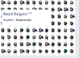
Read Regular
Designed to assist dyslexic readers, Read Regular is a typeface designed by Dutch designer Natascha Frensch. Letterforms like b and d are typically drawn as the same character and then just swapped. Read Regular differentiates these forms by making each unique.

AIGA - They're not fonts!
It seems that just about everyone is using the word “font” when they are referring to a typeface. “Fonts” and “typefaces” are different things. Graphic designers choose typefaces for their projects but use fonts to create the finished art.

Free Secure Online Storage — Xdrive
Get 5GB of FREE space, and save a secure copy of your photo collection, home videos, music, and any other digital file! X drive / Xdrive
August 2006
Typeradio, now we are talking
Typeradio, the radio channel on type & design.
Type is speech on paper.
Typeradio is speech on type.
Typeradio is a Microfm broadcast, a MP3 internet radio stream and a podcast station. Since 2004 Typeradio (which is Donald Beekman, Liza Enebeis aka LoveLiza & Underware) is visiting different design events around the world, to meet designers and to talk.
Helvetica
Helvetica is a feature-length independent film about typography, graphic design and global visual culture. It looks at the proliferation of one typeface (which will celebrate its 50th birthday in 2007) as part of a larger conversation about the way type affects our lives. Helvetica will begin screening at film festivals worldwide starting in early 2007.

July 2006

Quirky serifs aside, Georgia fonts win on Web - Style - International Herald Tribune
The IHT on a resurgence in popularity of the Georgia typeface online - "That is why we felt ready to forsake Verdana's clarity for Georgia's quirky serifs - at least until the next newly fashionable typeface comes along.'
April 2006
January 2006
dotWiki > Articles > TheWindowsVistaFonts
# Cambria is a smaller, more readable version of Georgia. Then again, all serif fonts look alike to me.
# Calibri is like a slightly condensed version of Corbel and Candara.
# Calibri, Candara, and Corbel are all too small compared to the current set of de facto Windows fonts (such as Georgia at 12pt compared with Calibri at 12pt) to make them impossible to use along with a current Windows font in a browser. For example, using Georgia and Calibri in your browser produces readable serif text but small, unreadable sans-serif text since both fonts must use the same font size.
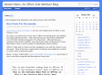
Jensen Harris: An Office User Interface Blog : Fonts
Last month, I introduced Segoe UI, the new user interface font for Office 12 and Windows Vista.
Of course, you spend most of your time in Office not looking at the user interface, but working with documents. Times New Roman has been Word's default font since Word 6.0 introduced support for TrueType fonts. Although there are numerous other options available, most documents today are produced in Times New Roman, Arial, or more recently the Web-friendly choice Verdana.
Scobleizer - Microsoft Geek Blogger » Cleartype improves reading comprehension, study says
Microsoft ClearType is an unprecedented innovation in font display technology that dramatically improves font display resolution and marks a genuine breakthrough in screen readability.
Coding Horror: Consolas and ClearType
However, I prefer not to use font smoothing on my programming fonts. And Consolas looks like crap without ClearType! Consolas appears to lack any kind of hinting for reasonable display at small point sizes. Consolas isn't just optimized for ClearType, it can barely be used without it.
Microsoft Typography - Features of TrueType and OpenType
Microsoft ClearType is an unprecedented innovation in font display technology that dramatically improves font display resolution and marks a genuine breakthrough in screen readability.