2007

Presentation Zen: What is good PowerPoint design?
Occasionally, I'm asked by colleagues or clients to send samples of "great slides" or "good PowerPoint." I usually hesitate to send examples of slides since my answer to the question, "what does a great PowerPoint slide look like?" is "...it depends." In a world which often thinks in terms of absolutes — "this is good, that is bad" — "it depends" is not the most popular answer.

Consider™ | Wire
Wire is committed to the inclusive design agenda – helping designers understand how their work can be made accessible to everybody. Consider™ is Wire’s award-winning concept that helps graphic designers and their clients understand the effect of common visual impairments.
Consider™ is a desktop tool that can be launched from any design software package or PDF reader. The first part of the software allows designers to identify common visual impairments (such as such as dyslexia, colour blindness, refractive error and partial sight) in their target audience.
Consider™ then replicates common eye conditions to enhance the designer’s understanding of different impairments. It also recommends how designs can be improved to make them more inclusive. The software does not deliver prescriptive solutions. Instead it helps the designer to understand the principles underlying inclusive design and shows how they might make their work more inclusive.
Consider™ won the Design Business Association’s Inclusive Design Challenge 2006. Judges called Consider™: ‘a brilliant, intuitive tool with wide-ranging scope that will change perceptions among designers and their clients regarding inclusive design.’
You can find out more about the DBA Inclusive Design challenge at the DBA site and The Helen Hamlyn Research Centre
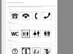
Comparative Test of Public Symbols - The Form Assembly
This is an online survey to research the existing public symbols and pictogram standards. In the list each topic or theme has four visual answers, please choose the most easily identifiable sign from the rows. Thanks for your patience!
2006
graphpaper.com - Microsoft Word’s Useless Buttons
It’s not bragging (in fact, it’s probably a little embarassing) for me to say that I am an expert user of Microsoft Word. I can do just about anything I want with it, and I understand most of Word’s idiosyncracies and tricks. Still, the UI has always seemed to get in my way. For example, there are a ton of buttons I never use — so for kicks I decided to see just how many.
Anil Dash: Office 2007 is the Bravest Upgrade Ever
By radically changing the user interface in Office 2007, Microsoft made the riskiest bet in the history of commercial software. And I think they're going to win the bet.
2005

Stopdesign
Douglas Bowman is an influential designer whose highly publicized and hugely successful redesigns of sites like Blogger, Wired News, and Adaptive Path have pushed him to the forefront of standards-compliant web design.

37signals » Web Design and Usability Experts
37 signals is an elite team of expert web design and usability specialists dedicated to simple, clear, and usable customer-focused design.
1
(7 marks)