2018
2017
Zircle UI : A circular zooming UI LIbrary powered by Vue.js - Vue.js Feed
Zircle UI is a circular zooming user interface library based on Vue.js.
2016
tvOS (Apple TV) UI Kit Sketch freebie - Download free resource for Sketch - Sketch App Sources
A free UI Kit / starter kit for tvOS design following Apple's Human Interface Guidelines.
You'll need San Fransisco, Apple's font of choice for everything on the Apple TV:
2015
Characteristics of a well designed user interface
"Designing a good user interface is like tightrope walking: it's all about finding the right balance."
2014
5 | 5 Things UX And UI Designers Could Learn From Wes Anderson | Co.Design | business + design
Director Wes Anderson has always been distinguished for his visual artistry, detail-rich sets, and storybook-like imagery. From the whimsical, campy feel of Moonrise Kingdom to the carefully crafted sets and miniatures in The Grand Budapest Hotel, Anderson’s movies are visual masterpieces.
Google Is About To Take Over Your Whole Life, And You Won't Even Notice | Co.Design | business + design
GOOGLE'S NEW DESIGN ETHOS, LIVING ON AND BEYOND EVERY SCREEN, COULD MAKE GOOGLE AN AMORPHOUS PROBLEM SOLVER OF UNIMAGINABLE SCALE.
Introducing image grids — The Story — Medium
When you click the “image” tool during the drafting of your story, try selecting multiple picture files from the pop-up window. Then, watch how Medium automatically lays them into a grid, depending on the number of images you selected. You can also click any individual image to see it bigger.
Read Time and You — The Story — Medium
Eons ago, a couple of Medium engineers got fed up. They were sick of having to scroll all the way down the page to see how long a story was. It was wearing out their trackpad, it was making their fingers sore, and they figured there must be a better way. So they sat down and devised a simple formula, and the Medium read time was born.
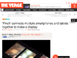
'Pinch' connects multiple smartphones and tablets together to make a display | The Verge
Not content with synchronizing your phones to make one giant speaker? Researchers at the Tokyo University of Technology have developed "Pinch," an interface that lets you connect multiple devices together to form a giant disjointed display. Although the technology behind the interface remains a mystery — described only as a Wi-Fi based system — a video posted by DigInfo TV shows Pinch in action. To connect two devices, a user simply needs to pinch two adjacent screens together. The screens can be linked together in whatever alignment you choose, as the position and screen size of each display is communicated on a successful pinch. It's not the first time developers have managed to link together multiple smartphone displays, but this is definitely the slickest interface we've seen.
capptivate
Back in June of 2013, I launched Capptivate.co: a kinetic pattern library that captures and preserves delightful iOS animations. For an overview of the thinking behind the site, how to use it, and info about the tools I used to build it, read this post.
by alice lee | carousel
Carousel is the new gallery from Dropbox that helps you organize, share, and save your photos and videos with friends and family (remember having to individually send every photo in a set over iMessage? Yeah, no more!). It’s an app that holds your photos and videos, and therefore your memories - and its story needs to do it justice.
Hold the hamburger | Isotoma Blog
I’ve noticed a worrying trend in web navigation lately. More and more websites are hiding their navigation – at desktop resolutions – under a single button, often the 3-bar “hamburger” icon.
2013


Pyrolia-Who We are
Pyrolia is an independent multimedia studio.
We bring together the best talents and innovators from book publishing, film, music,
graphic production, special-effects, interface design and software development to create
truly immersive digital experiences that we initiate, conceive, produce and publish.
Founded in 2011 by Charles-Evrard Tchekhoff, Pyrolia is backed by
high profile individuals from media, banking and entrepreneurial backgrounds.

iOS 7 Wireframe Kit by @bperdue
Born out of my own need for a good way to rapidly wireframe in Illustrator, this kit contains the most common UI elements in iOS 7 Beta 3. If you spot something I missed, fork it or shoot me a note.

The Wi-Fi in your home can track your moves like Xbox Kinect - NBC News.com
Want to switch off the living room lights from bed, change channels while washing dishes, or turn the heat up from the couch? A team at the University of Washington has rigged a standard Wi-Fi home network to detect your movements anywhere in the home and convert them into commands to control connected devices.
Jetstrap - The Bootstrap Interface Builder
An interface-building tool for Twitter Bootstrap

2012


Learning to Love Humans: Emotional Interface Design // Speaker Deck
Humans, though cute and cuddly, are not without their flaws, which makes it a challenge to design for them. By understanding how the wet, mushy processor works in these hairy little devils, you can design interfaces and web experiences that will have them hopelessly devoted to your brand. Aarron will introduce you to the emotional usability principle—a design axiom that identifies a strong connection between human emotion and perceived usability.

12 blogs et sites francophones sur l’ergonomie
L’ergonomie des interfaces fait parler de plus en plus ! Nous vous proposons un tour d’horizon des blogs et sites francophones actifs (en avril 2012) qui traitent d’ergonomie des interfaces au sens large. Ce billet met à jour la liste que nous avions déjà publié en 2010.


