2017

2015
2014

TechCrunch - SuperFriendly
 by sbrothier
TechCrunch is a news site that focuses on information technology companies. We partnered with a few of our friends to help TechCrunch create a new responsive site.

Device-Agnostic | Trent Walton
by sbrothier & 1 other
As web designers, it is our role to consider (and plan for) maximum reach and access, even when final results might seem underwhelming or less immersive. I used to think of device-agnostic responsive design as something that would simply make my life as a site builder easier.
2013
Tildigital : la performance digitale par nature
by mydruid
Tildigital intervient pour mettre en place vos stratégies digitales & relationnelles, pour obtenir l’engagement de vos clients et pour améliorer les performances de vos dispositifs marketing.
Conseil en marketing
Relation client
Marketing automation
Webdesign, Sites Webs
Applications web & mobile
E-Commerce
Blogs, Microsites
Sites évènementiels
Email marketing
Responsive design
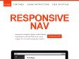
Responsive Nav — Responsive Navigation Plugin
 by dzc & 3 others
Responsive navigation plugin without library dependencies and with fast touch screen support. Try it out by resizing this window.

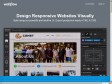
Webflow - Design Responsive Websites Visually
by dzc & 2 others
Design Responsive Websites Visually
Build using our powerful and intuitive UI. Export production-ready HTML & CSS
Webflow - Design Responsive Websites Visually
by sbrothier & 2 others
Build using our powerful and intuitive UI. Export production-ready HTML & CSS.
2012

USA Today website innovates with horizontal experience, information layers | Poynter.
by sbrothier
USA Today introduced a new version of its website Saturday, one day after it debuted a new design in print. My overall impression: The new site does not feel like a newspaper website, it feels like a news website. It also feels a bit like an iPad app, with a horizontal experience and visual emphasis. A click feels like a finger swipe. Gannett/USA Today Director of Product Design Bill Thornton said in a tweet, “We think the key is to make the experience more app-like and have fewer hard page refreshes.” Still, the site feels like USA Today because it’s anchored by images and color. Here are five reasons the reinvention works for me.
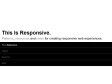
This Is Responsive | Tips, Resources and Patterns for Responsive Web Design
 by julie & 2 others
This Is Responsive.
Patterns, resources and news for creating responsive web experiences.

Creative UI Design Examples for Great UX | Awwwards
by sbrothier & 1 other
UX (User Experience) is all those elements and factors related to the user’s interaction with a particular environment or device which generate a positive or negative perception of the product, brand or device. UX is subjective and focused on use. The standard definition of UX is “a person’s perceptions and responses that result from the use or anticipated use of a product, system or service”. These factors are related to design and usability, but also to the emotions and feelings generated in the user, accessibility, brand trust…
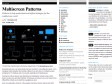
Multiscreen Patterns | precious, strategic design & visual language
by sbrothier (via)
During the last years, our design studio has been involved in many different projects – from designing mainly websites and desktop software in our early days, to smartphone apps, prototypes for TV interfaces and more recently, applications for tablet devices.
Working for all those devices was interesting and challenging. Not just because of the diverse screen sizes and input methods, but because we learned in our user research how different the contexts are in which these gadgets are used.
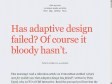
Has adaptive design failed? Of course it bloody hasn’t. » Blog » Elliot Jay Stocks
by sbrothier (via)
This morning I read a ridiculous article on VentureBeat entitled ‘what’s next for mobile now that adaptive design has failed?’, written by Peter Yared, who is CTO of CBS Interactive. Read the post and you’ll see that the entire thing is based on the misassumption that mobile users don’t scroll. If that were true, the reasoning might be valid, but it’s not. It’s utter nonsense.
The case for responsive design | VentureBeat
by sbrothier
Peter Yared, CTO of CBS Interactive, stirred up a bit of controversy recently when he wrote that adaptive design techniques make it difficult for publishers to monetize content.
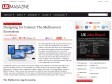
Designing for Context: The Multiscreen Ecosystem | UX Magazine
by sbrothier & 2 others
To create applications and systems that are easy to use, it is crucial to understand the user and the context in which the app will be used. Understanding the context helps design systems that anticipate use cases at a relevant time of use. The more unobtrusive and transparent the experience is at the time of use, the better the design. This means the user does not have to think about the device he is using, changes in the environment, or changes in context, and can rely on great functionality and ease of use independent of his situation.


Applying Macrotypography For A More Readable Web Page | Smashing Magazine
by sbrothier
Any application of typography can be divided into two arenas: micro and macro. Understanding the difference between the two is especially useful when crafting a reading experience, because it allows the designer to know when to focus on legibility and when to focus on readability.
A non-responsive approach to building cross-device webapps - HTML5 Rocks
by sbrothier & 3 others
Media queries are awesome, a godsend for website developers that want to make small tweaks to their stylesheets to give a better experience for users on devices of various sizes. Media queries essentially let you customize the CSS of your site depending on screen size. Before you dive into this article, learn more about responsive design and check out some fine examples of media queries usage here: mediaqueri.es
LukeW | Multi-Device Layout Patterns
by sbrothier & 1 other
Through fluid grids and media query adjustments, responsive design enables Web page layouts to adapt to a variety of screen sizes. As more designers embrace this technique, we're not only seeing a lot of innovation but the emergence of clear patterns as well. I cataloged what seem to be the most popular of these patterns for adaptable multi-device layouts.