public marks

PUBLIC MARKS with tags accessibilité & couleurs

2014

2013

2012

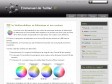
Easy color contrast ratios | Lea Verou

by Monique

Browser support is IE10 and modern versions of Firefox, Safari, Chrome, Opera. Basic support for IE9. No responsive version yet, sorry (but you can always send pull requests!)

ContrastA

by Monique & 3 others
WCAG 2.0 Luminance Contrast Ratio Accessibility Color Picker

Color Oracle

by Monique & 1 other

Color Oracle is a free color blindness simulator for Window, Mac and Linux. It takes the guesswork out of designing for color blindness by showing you in real time what people with common color vision impairments will see.

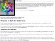
Color Laboratory -- AWARE Center -- HTML Writers Guild

by Monique & 2 others

This color laboratory allows you to select colors and see how they appear next to one another, and in various foreground/background combinations. It also allows you to see those colors as they might appear to color-blind users.

2011

A Guide To Improve Your Website's Readability Through Colors

by Monique

Colors have a huge effect on readability. This is why you need to choose them wisely so that they not only create esthetically pleasing combinations but also make it easier for users to read the text. Text is an integral part of any site and we shouldn’t punish visitors for coming to our site by using hard to read color combinations.

2010

Checking colour contrast – Humanising Technology

by Monique
When people talk about colour contrast on the web, they’re usually thinking in terms of text and information rich images. Most people won’t care what colours you’ve used for your decorative swooshes. If they can’t read the information you’ve put on your website though, they’re likely to be quite unhappy about it.

Proper Standards-Compliant Color Use in Web Design

by Monique
Perhaps it is no secret to you that a good frontend design should be usable and accessible. That could be understood as having content that’s organized, readable, and understandable to everyone browsing the web, regardless of any impairment they may have.

2009

ColorBrewer Intro - Selecting Good Color Schemes for Maps

by Monique & 1 other
ColorBrewer is an online tool designed to help people select good color schemes for maps and other graphics. It is free to use, although we'd appreciate it if you could cite us if you decide to use one of our color schemes.

Accessible colour combinations | 456 Berea Street

by Monique
Different people have different needs when it comes to the colour combinations that they can read comfortably (or at all) on screen. But what colour combinations are actually preferred by people with dyslexia or vision impairment?

Lighthouse International - Effective Color Contrast

by Monique
Designing for People with Partial Sight and Color Deficiencies

Colour contrast - Web Access Centre

by Monique
Good contrast is essential for people with reading problems and low vision.

Everybody is Color Blind

by Monique
Are you colorblind? No, you don’t think so? — I am sure you also have some form of color vision deficiency or colorblind sensations. You don’t believe me? I’ll prove it in the following article.

Check My Colours -

by gregg & 3 others
Analyse the color contrast of your web pages

2008

2007

Active users

mfaure
last mark : 17/05/2014 08:00

Monique
last mark : 15/10/2012 19:29

gregg
last mark : 29/02/2012 17:02

shinze
last mark : 02/12/2010 11:22

sebastien
last mark : 19/03/2008 07:42