July 2016
include-media: Simple, elegant and maintainable media queries in Sass
by 1 other (via)include-media is a Sass library for writing CSS media queries in an easy and maintainable way, using a natural and simplistic syntax.
February 2016

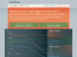
Resizer - Google Design
An interactive viewer that helps designers test material design breakpoints across desktop, mobile, and tablet.
October 2015
intention.js
Intention.js offers a light-weight and clear way to dynamically restructure HTML in a responsive manner.
Easily increase layout options and flexibility, reduce development time and lessen dependence on media-query-driven stylesheet overrides.
September 2015

Flickity
Flickity makes galleries, sliders, & carousels that feel lively and effortless.
February 2015

Ink: A Responsive Email Framework from ZURB
Quickly create responsive HTML emails that work on any device & client. Even Outlook.
January 2015
scottjehl/picturefill · GitHub
A responsive image polyfill for picture, srcset, sizes, and more
AnalogJ/matchmedia-ng · GitHub
by 1 othermatchmedia-ng is a set of AngularJS bindings and helper functions for the matchMedia javascript api. With matchMedia, AngularJS and matchmedia-ng you can automatically respond to the orientation, browser height, width and other properties supported by CSS Media Queries.
December 2014
L’intégration d’e-mails responsive – HTeuMeuLeu
Ces derniers mois, j'ai eu la chance de travailler à plusieurs reprises sur l'intégration d'e-mails responsive. C'est un sujet particulièrement intéressant qui rapproche des technologies préhistoriques (mise en page en tableaux, support CSS archaïque) avec des concepts modernes (du responsive design). C'est un peu comme si un scientifique fou décidait de resusciter des dinosaures.

October 2014

BeeFree | Free email editor to build responsive design messages
by 6 othersRich email messages made easy
ProgressBar.js
With ProgressBar.js, it's easy to create arbitrary shaped progress bars. This library provides a few built‑in shapes like Line, Circle and Square but you can also create your own progress bars with Illustrator or any vector graphic editor.
Strip - A Less Intrusive Responsive Lightbox
by 2 othersStrip is a Lightbox that only partially covers the page. This makes it less intrusive and leaves room to interact with the page on larger screens while giving smaller mobile devices the classic Lightbox experience.
1
(12 marks)
