July 2006
F-Shaped Pattern For Reading Web Content (Jakob Nielsen's Alertbox)
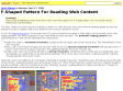
by 7 othersEyetracking visualizations show that users often read Web pages in an F-shaped pattern: two horizontal stripes followed by a vertical stripe.
June 2006
BumpTop Prototype - HoneyBrown.ca
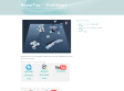
by 10 others (via)BumpTop aims to enrich the desktop metaphor with expressive, lightweight techniques found in the real world.
graphpaper.com - Microsoft Word’s Useless Buttons
It’s not bragging (in fact, it’s probably a little embarassing) for me to say that I am an expert user of Microsoft Word. I can do just about anything I want with it, and I understand most of Word’s idiosyncracies and tricks. Still, the UI has always seemed to get in my way. For example, there are a ton of buttons I never use — so for kicks I decided to see just how many.
Anil Dash: Office 2007 is the Bravest Upgrade Ever
by 1 other (via)By radically changing the user interface in Office 2007, Microsoft made the riskiest bet in the history of commercial software. And I think they're going to win the bet.

Veerle's blog
by 17 othersI’m a graphic/web designer living in Belgium. My personal journal is an online source for topics ranging from XHTML/CSS to graphic design tips.
I began my career in 1992 as a freelance graphic designer under the name of Duoh!. The first 3 years were mainly filled with print orientated work such as logos and stationary.

Web feed icon trademark, licensing and usage guidelines : pretty widgets
by 1 otherI am encouraged to read Mitchell Baker’s posts (part 1, part 2) about the usage of Stephen Horlander’s web feed icon which is seen in Firefox, IE7 and on an increasing number of web pages. She suggests that Mozilla should work with the web community to set usage guidelines for the icon. This is a great idea. Guidelines are necessary to avoid confusing web users about the meaning of the image.
Subtraction: Little Orange Icons
(via)The world of XML syndication is still a soup of acronyms and counter-intuitive terminology — RSS, Atom, XML, feeds, aggregation, ’casts, etc. — but at the very least, we’re inching towards visual standardization in how we represent it iconographically. Microsoft, in an uncharacteristic but laudable show of cooperativeness, agreed late last year to adopt Firefox’s orange RSS/XML icon — a rounded little square with featuring what might be best described as ISO-style broadcast waves — for its Internet Explorer 7 browser.
May 2006
BBC - bbc.co.uk Standards & Guidelines - Home Page
BBC Online Technical, Design & Editorial guidelines
April 2006

Vitamin Features » Making Popular Layout Decisions
Every time you make a layout decision - fluid vs fixed, scaled vs percentage, a few more people hate you. How do you make the right decisions and when?
March 2006
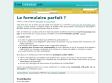
badboy.media.design :: articles :: Niceforms
by 23 others (via)Web forms. Everybody knows web forms. Each day we have to fill in some information in a web form, be it a simple login to your webmail application, an online purchase or signing up for a website. They are the basic (and pretty much the only) way of gathering information on the web.

uiGarden.net - Weaving Usability and Cultures: Designing usable forms: the three-layer model of the form
(via)Why do people say “I’m not good with forms” or “I don’t like forms” when a form is only a piece of paper, or a screen, with some printing on it? There must be something special about forms that inspires these comments.
Simply Accessible: Required Form Fields
by 2 othersOver time a standard seems to have emerged for denoting required fields: changing the style of the label making it bold and/or red, and often including an asterisk beside the input text form control. Often times this asterisk is placed to the right of the input box, and consequently after the text box when examining the source order.
December 2005
Subtraction: The Funniest Grid You Ever Saw
(via)An in-depth look at the complicated layout grid behind The Onion.

Five simple steps to designing grid systems - Part 4 : Journal : Mark Boulton | Information design
by 2 othersLayout seems to be a hot topic at the moment, mostly prompted by the ALA redesign and the numerous discussions of the choice by Jason and the ALA team to go 1024 for a fixed width. I'm not going to go into my thoughts on ALA in too much depth here, there's been a lot of that already, but it seems like the right time to get this article out.

August 2005
Mac Mini for Mom
My Mom’s old EMachines Win98 box wasn’t actually broken, but it was tough to support remotely and the camera-company software that came with her digicam was really lame. So I ordered her a Mac mini and now it’s up and running. This gave me a (rare) chance to watch the OS X experience through a novice’s eyes.

Vischeck
Vischeck's color vision model allows you to simulate how the world looks to people with various sorts of color deficiency. As you can see from these examples, 'color blindness' is really a misnomer- most 'color blind' people do in fact see colors!
July 2005
Site officiel de J.K.Rowling
by 4 othersSympa comme tout le site de l'inventeur de Harry Potter designed by Lighmaker Goup en collaboration avec Macromedia, le RNIB et le RNID. et en plus c'est du flash très "usable", navigation au clavier, menu accessible, possibilité d'agrandir le texte, pause, glossaire des sons.... cf le post de Jeffrey Zeldman
June 2005
veblog: flash et utilisabilité, le livre blanc
by 2 othersPeut on utiliser Flash pour améliorer réellement l'expérience utilisateur du web ? Oui ! Mais pour cela, comme avec les autres technologies du web, la création d'interfaces en Flash doit respecter les règles de l'utilisabilité et s'inscrire dans un processus de développement centré sur l'utilisateur. Chris Mac Gregor, éditeur de Flazoom.com, a publié un "white Paper" (repris par Macromédia sur son site) expliquant tout cela. Cet article m'a tellement plu qu'avec l'autorisation de son créateur, je l'ai traduit.
26steps to 15k a Day
by 7 othersLearn the lesson of Google itself - simple is retro cool - simple is what surfers want.

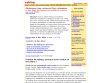
Des formulaires plus simples
by 3 othersRemplir un formulaire en ligne n'est pas une tâche facile. Trop compliqués ou trop intimidant, les formulaires sont la hantise des utilisateurs. Il existe cependant un certain nombre d'actions possibles pour faciliter la lecture à l'écran, diminuer les sources d'erreurs possibles et les rendre plus simples d'utilisation
My first 48 hours enduring Ubuntu 5.04
by 1 otherInteressant description, analysis, list of the most important design flaws in Ubuntu.
Designit - All around you
by 1 otherDesigning your brand from product to communication.
Cool web design.