November 2007

Space Alphabet
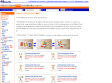
In honor of Sputnik 1, 50 years later (on Oct. 4th), I present to you all a nice little gem of a book I got off of ebay about a year ago: Space Alphabet (1964) by Irene Zacks. Pictures by Peter P. Plasencia.
It's the entire book. I normally don't do this, but it's just too good not to share it all.
July 2007
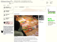
JBOOK: [kokuyotoipogurahui]
It is the strange vision unrestricted building block where as for “[toipogurahui]”, when the part is rearranged, the English word becomes Chinese character of the same meaning, becomes the picture. While rearranging small and large various parts, playing pleasantly, it can cultivate the creativity of the children by experiencing the work of producing new shape. The material uses the Buna material where the Hokkaido product is selected, has become the completion where you can feel feeling good quality in material feeling such as touch. Not only the child way, also the adult moves the hand personally, by the fact that you think, everyone and others creativity (the flash) can forge pleasantly.
April 2007

Toypography @ Kidsmodern
Kokuyo, a famous Japanese stationary chain, and Dainippon Type Organisation assembled a team that investigates an intellectual training toy and an educational game for Infantile education. The researchs and developments focus on toys or games that brings up "power to think". The result is Toypography.
Toypography is a toy of typography – fragments of letters, that can be put together to either Latin or Japanese letters.
The mysterious thing about Toypography is, that Japanese expressions can be transformed into English expressions of the same meaning.
Kokuyo will be selling Toypography soon.
November 2006

John Lawrence Templates - Quality teaching aids
We manufacture top quality wooden templates & teaching aids in two thicknesses of plywood
October 2006

Why Sassoon ?
Sassoon® typefaces were researched and the findings published by handwriting expert Dr. Rosemary Sassoon and since 1987, in partnership with Adrian Williams a whole range of font products for reading and handwriting education in schools has been developed. They cater for National Literacy Strategy Guidelines used in UK schools.
September 2006
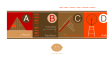
Jargon Boy | Modern Alphabet Flashcards
M is for Modern Alphabet Flashcards. A pocketful of genius. Coolness in a box. A Mid-Century Modern education in 26 remarkably easy lessons. Or a way to keep your kids busy on the train to the City or the 101. Forget A is for Apple. B is for Bauhaus is where it's at. Cards are 2 3/4" x 2 3/4", packaging is 3" x 3" x 3/4 ", info is immeasurable.
1
(10 marks)