2014

2012
Multiscreen Patterns | precious, strategic design & visual language
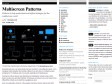
(via)During the last years, our design studio has been involved in many different projects – from designing mainly websites and desktop software in our early days, to smartphone apps, prototypes for TV interfaces and more recently, applications for tablet devices.
Working for all those devices was interesting and challenging. Not just because of the diverse screen sizes and input methods, but because we learned in our user research how different the contexts are in which these gadgets are used.

Responsive Navigation Patterns | Brad Frost Web
by 5 othersTop and left navigations are typical on large screens, but lack of screen real estate on small screens makes for an interesting challenge. As responsive design becomes more popular, it’s worth looking at the various ways of handling navigation for small screen sizes. Mobile web navigation must strike a balance between quick access to a site’s information and unobtrusiveness.
1
(3 marks)