2016
2014
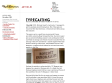
Alien | Typeset In The Future
My third post about typography in sci-fi has been gestating for a while now. Indeed, it's been slowly taking shape – you might say it's been forming itself inside of me – for really quite some time. I'm delighted to say that it is now ready to burst forth from my allegorical chest, and to spatter allegorical typographic blood all over your allegorical faces. Welcome to Typeset In The Future: The Alien Edition.

2012
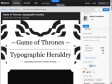
Game of Thrones: typographic heraldry on the Behance Network
Typography meets Game of Thrones Heraldry
2010

the Movie title stills collection
I've seen a lot of movies over the years, and to prove I've sat through at least the first ten minutes of them I started making screenshots of the titles. Then my computer crashed and I almost lost them all. To save them for future generations I created this little website.
2009
Cozy Lummox
Eric Skillman: I'm a Brooklyn-based graphic designer, mostly making DVDs at my day job with The Criterion Collection, though I try my hand at books and such occasionally.
Cozy Lummox: Pigs, Pimps and Prostitutes
So... Pigs, Pimps and Prostitutes! This is a recent favorite of mine--three great films, and I was very happy with how the design came together. A different animal than my previous Imammura cover, Vengeance is Mine, but both are personal favorites, actually.
Here's the first idea I had, which is pretty close to the final covers
2008
The Art of the Title Sequence -
A compendium and leading web resource of film and television title design from around the world. We honor the artists who design excellent title sequences. We discuss and display their work with a desire to foster more of it, via stills and video links, interviews, creator notes, and user comments. Featuring opening title design for film and television from Croatia, New Zealand, Serbia, Russia, the United States, Brazil, England, France, India, Japan, Italy, Chile, Mexico, Yugoslavia and Egypt.
{ Pretty Cool People Interviews }
In Paris we met with one half of the design duo that makes up Studio Deubal. Deubal is a French creative agency consisting of Stéphanie Lelong and Olivier Marquézy. We fell in love with their original character-based title sequence designs. When we visit Olivier in his studio, he's on his last legs. He's been pulling an all-nighter.
2007

Forget the Film, Watch the Titles
Today, the term animation is used broadly and encompasses a vast array of styles and technologies that are used to create the illusion of motion. Here, we focus on some really good examples of the use of animated characters in film title design. Not only do these title sequences list the main credits, they have animated characters that introduce us to the story of the film. None of these films are animated.
As the collection of animated title sequences grows, more animation-related sub-themes will help to shed more light on the use of animation in main title design.

24 fps : un album photos sur Flickr
Flickr collection of closing frames from classic movies. Beautiful typography
shillPages - Movie Title Screens Page
What good is it? Whatever use you put it to. Browse and admire title and logo designs, check out movies that have completely different titles in different release prints (see Battle of Britain or The Premature Burial for good examples), check out the differences in multiple releases of the same title (see Aliens or Invasion of the Body Snatchers for a good example), check to see just how "wide" is the widescreen (width/height=aspect ratio... and does it match the sleeve description?)... use the logo when designing a web page for your favourite movie...include the title screens in your video database... the possibilities are... well, not endless, but many! Please note that the aspect ratio shown is merely calculated from the image size and, although very close to the actual ratio, may not be 100% accurate.
Core77 Broadcast: Gary Hustwit in Helvetica, interviewed by Alissa Walker
Once simply the name of the most ubiquitous typeface on the planet, now the documentary Helvetica is becoming almost as ubiquitous--at least among members of the design community. The film not only tells the story of the typeface itself, from its birth in Switzerland fifty years ago to current gig as American Apparel mascot, but it also serves as an entertaining primer on modern graphic design, featuring major players from Massimo Vignelli to Experimental Jetset.
Saul Bass' Movie Title on Youtube
During his 40-year career Saul Bass worked for some of Hollywood's greatest filmmakers, including most notably Alfred Hitchcock, Otto Preminger, Stanley Kubrick and Martin Scorsese. Via Neatorama and Blogdecine

2006
Helvetica
Helvetica is a feature-length independent film about typography, graphic design and global visual culture. It looks at the proliferation of one typeface (which will celebrate its 50th birthday in 2007) as part of a larger conversation about the way type affects our lives. Helvetica will begin screening at film festivals worldwide starting in early 2007.

2004
1
(21 marks)


