2010

The 1140px CSS Grid System/Framework · Fluid down to mobile
 by gregg & 5 others
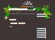
The 1140 grid fits perfectly into a 1280 monitor. On smaller monitors it becomes fluid and adapts to the width of the browser.
Beyond a certain point it uses media queries to serve up a mobile version, which essentially stacks all the columns on top of each other so the flow of information still makes sense.
Scrap 1024! Design once at 1140 for 1280, and with very little extra work, it will adapt itself to work on just about any monitor, even mobile.

WordPress › Shadowbox JS « WordPress Plugins
 by mozkart
Shadowbox is an online media viewing application that supports all of the web's most popular media publishing formats. Shadowbox is written entirely in JavaScript and CSS and is highly customizable. Using Shadowbox, website authors can display a wide assortment of media in all major browsers without navigating users away from the linking page.
2007
2006


2005


Les types de media CSS - Blog & Blues - Standards Web et accessibilité
 by nhoizey & 2 others (via)
voici un rapide tout d'horizon des types de media CSS, de leurs implémentation actuelles, de leur intérêt... et de leurs limites
1
(10 marks)